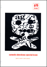
Cornelis Vleeskens Special Issue
Pete Spence, ed.
p76, Issue 7, 2014
The first indication that the contents of this special issue hovers in the Venn overlap of art and poetry lies in its ‘curation’, not ‘edit’. Spence’s project was to ‘sample from a mass of work … to (make) a small but intense window’ (p. 5), and he does this by being true to the materiality of Vleeskens’s visual output. The nostalgic production values of the journal itself – photocopied in black and white on A4 paper, stapled, and with no frilly bits – is a perfect match for Spence’s vision and Vleeskens’s visual practice, which was firmly embedded in the intersections of text and image.
Cornelis Vleeskens (1948–2012) was a Dutch immigrant, arriving in Australia in 1958. From various accounts he was prolific, experimental and wide-ranging in his interests. At the end of the issue, his published poetry is listed ‘towards a bibliography’, with over 100 works cited, a number of them in Dutch. An increasingly bilingual practitioner, he also translated Dutch poetry into English, and was involved in international text art activities such as fluxus-style exercises (p. 19) and mail art: see David Dellafiora’s digital epitaph at Field Studies.
Many of his publications are self-published, also hovering in the coloured overlap between chapbook and zine in our contemporary publishing taxonomy. Spence omitted Vleeskens’s prose works, commercially published work and collaborative work, but he did include an essay written about ‘the portrayal of Aboriginal culture on Australian postage stamps and related philatelic products’, an important empirical survey connecting his political and mail art interests, as well as a small collection of personal recollections of the man and a review of some of his more conventionally-published work by p76 editor Mark Roberts that were originally included in the Rochford Street Review. What this collection exhibits is the visual poetry strand of Vleeskens’s life work.
From the evidence presented, Vleeskens’s tools were simple, effective and close at hand: pen, brush & ink, typewriters, scissors and glue, photocopiers and later, a computer & printer. These processes echo the broad span of activity represented in this collation: drawings, paintings, typescripts of prose, poetry and conceptual art, and collage. There are drawings on found text, found text with drawings, drawn text with drawings, collaged images and collaged text.
For me, as an artist and designer who works with poetry, the work by Vleeskens that is visually immediate is his most effective. By this I mean the work that is only one step removed from the medium used to create it, that step being photographic (or photocopy) reproduction. There is hardly any visual translation away from the moment of composition. When poets compose, they might use various stages of handwriting, from scrawl through to typescript, or they might just type into a computer – but that typescript is then visually translated by a designer or desktop publisher, and perhaps the poems are complemented by an illustrator or original art, in a text/image dichotomy. Vleeskens had a whole thread of text/image integration that would be presented on the page (pp. 13–14) or by exhibition (pp. 7–10), depending on the weight of text to image, or vice versa.
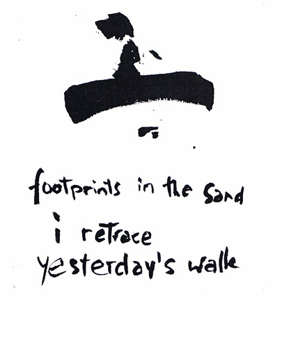
Many contemporary graphic illustrators push against the separation of text and image by incorporating text into images by using the same material process and hence visual language for both. By doing this they are enhancing the shared (or sometimes opposite) meanings. Vleeskens used brush and ink, not quite in a traditional calligraphic sense, but he perhaps recognised that the flow of the ink formalised his handwriting. Throughout the pages of this collection, there are various texts using this brush-and-ink hand, and there are a number of brushed ink drawings akin to Asian calligraphy. When the two are combined, their power increases, as in the following example (p. 33) where the abstract image picks up a hint of the figurative, and the handwritten text gains authority.
At the centre of the issue is a page called SEVEN SMALL POEMS REMOVED FROM THEIR SETTING (p. 47), a title that could easily have been adapted for the entire volume, to highlight that one step of remove and perhaps draw attention to the fact that there is less removal than the average poetry volume. For Cornelis Vleeskens, the setting is always immediate, the membrane between visual art and writing sometimes so thin as to be almost invisible. These seven small poems are short, relatively unlineated sketches, typewritten in a generic computer or typewriter font that weaves through the issue, but flipping back a few simple bond pages there is a good example of the effects of immediacy and removal from setting: FOR LOVE is a five-page text collage gleaned unmistakably from magazine typography.
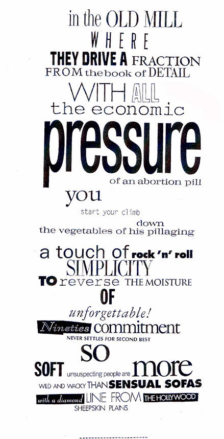
An excerpt from For Love (pp. 22-26).
What Vleeskens achieves here is more animated than a mere adjustment of type size and basic styling (bold, italic, underline) could achieve. Whole phrases of graphic design font confections push and pull meaning like a roadside full of billboards, except that there is a real sense of agency here. Vleeskens has not randomly cut up text and rearranged it; one gets the sense that the poet is riding serendipity, with perhaps no set agenda, but that there is an underlying project that aims for sense rather than non-sense. He is composing with his found text, not arranging, and there is a distinct difference. When this method of composition is removed from its setting, as the next two poems obviously are, there is a hollow ring:
POEM

WHY
An Italian stimulant
and a young rounded overture
escape the closet
has nothing to do with
Belgian Goth & the New York apartments

but their imitators don’t seem to know

so
model appeal and    caffeine
feel more sparkly
UPTOWN
epitomizing
the unforgettable final reel (p. 27)
The found text has lost its sparkle. Trying to recreate the process using whatever digital fonts are available on the computer would be forced and artificial because there would be an urge to typecast words with traditional font ‘personalities’: Comic Sans for the plebeian touch, serif fonts for seriousness, Helvetica for that touch of geek, Papyrus for the arty look. Newspaper and magazine typographers push these ‘personalities’ to ridiculous extremes to build colour – and sometimes to dogwhistle – and Vleeskens has pulled their semiotics out of context to build his own.
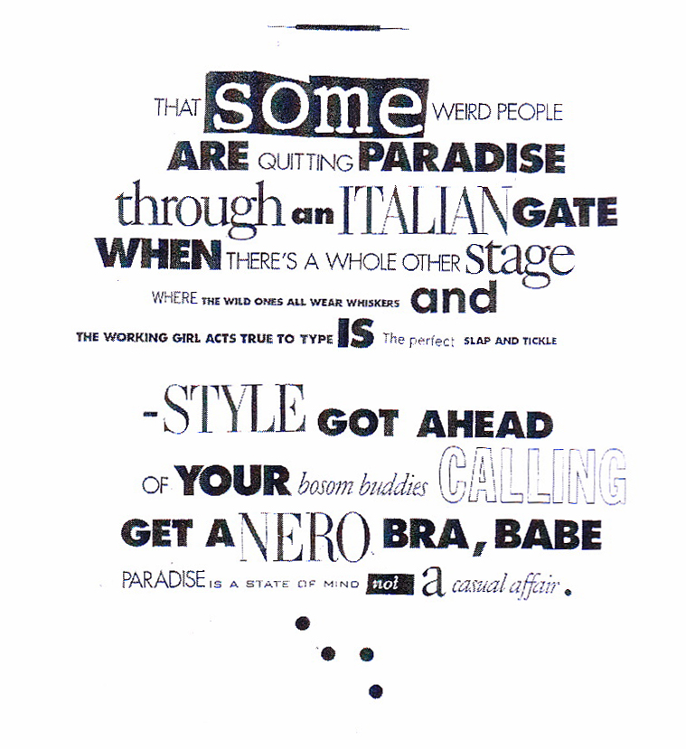
Look at the words ITALIAN, STYLE and NERO; obviously from the same headline from a magazine article, and the original typographer was using a modern serif font that evokes high fashion a-la Vogue magazine. It could have indeed been Vogue itself; so well branded is the magazine’s typography that such a typeface instantly makes one think of glossy high fashion. Vleeskens uses it instead to evoke Dante and the depths of ancient Rome, crossing, saving and enhancing cognitive time. FOR LOVE could only ever succeed as a photographic reproduction of its creation, relegating it to the status of visual art rather than typescript. Reproducing it in black and white does not make it less effective. In fact, it is a strategy, as it removes the original spackling of colour, which would add distraction, not perception. Sometimes, immediacy gains what further production would lose.
The works collected in this special issue have obviously been collated with care and purpose; it is not a glossy Festschrift by any measure (and by design), but I come away from the issue feeling that it works, that it is true what I imagine is Vleeskens’s ethos, and that it is a good and affectionate starting point for a broader survey of his work.


