Kern by Derek Beaulieu
Les Figues Press, 2014
I must admit: the first time I flipped through Kern and looked at the various swirling typographic entities, two thoughts jumped into my head; how similar the pages looked to work by Australian book artist Lyn Ashby, and the other was jealousy at how much vintage dry-transfer lettering (Letraset) Canadian poet Beaulieu obviously has access to. It’s hard to come by here in Australia, and what we can still get comes only in very restrained font styles.
Both of my thoughts are valid, since the author’s note to Kern positions this ongoing body of work as being typical of Lettrism (without actually naming the field), a graphic practice that emphasises the ‘glyphic nature of the visual sign’ and ‘proliferates meaning through its visual properties’1: ‘viewers need not read, they only need momentarily stare and receive’2. I received comparative thoughts and emotional flare. Other viewers, of course, will have differing receptions. I say ‘viewers’ because these are letterforms that dissuade reading. This is confusing: such visual typographic play is common amongst graphic designers, but this is poetry. Isn’t it meant to be read?
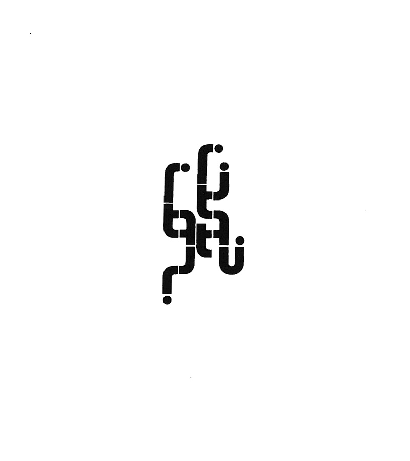
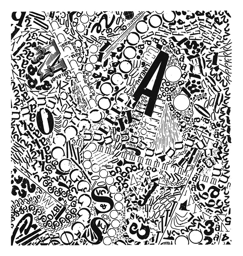
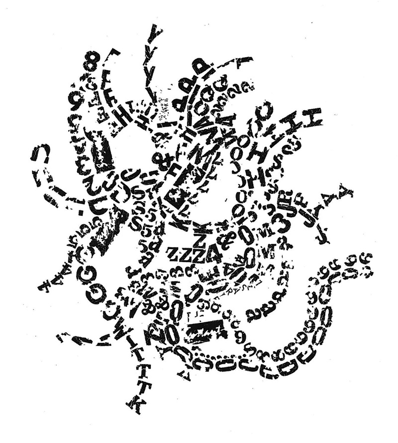
The overlap between experimental poetry publishing and artist books is fascinating, and still quite un-probed. If Kern were an artist’s book, I could talk about the sequence of images, how its march from small entities floating in white through to the overwhelming and crackling obliteration of the page space is a pessimistic foreshadowing of apocalypse. As a poetry volume, I can still say that – it’s hard not to think of societal breakdown when the object on the page is taking full advantage of its material origins by falling apart during the process of its very creation (cracking and failing to adhere, which is what Letraset does when it is rubbed too hard or not hard enough) – but there are ruptures in the sequence that undermine a clean visual reading. A book artist would allow the final images to move past the white borders of the page – bleeding out of the book – and would move back the vertical works on pages 82-85 so that they did not break the flow of disintegration. So, maybe not a straight line to dystopia.
Instead, we are offered other points of reference: ‘logos for the corporate sponsors of Jorge Luis Borges’s Library of Babel’, ‘airport signage’, ‘way-finding signage’, ‘semantic detritus’ (90) … all pointing to surface engagement, speed, and nonsense.
Again, my mind returns to Lyn Ashby’s book, called Ideo(t) Grammatica, which offers such visual similarity but with completely different intentions. Ashby is also way-finding: ‘the changes here gradually lead the reader, if they are willing, into stranger territory’3, the book itself offering itself as an ‘experimental petri dish’, growing letterforms that are meant to be read, and can be, if you move slowly from the start through the typographic cosmology to the aftermath of a big bang. The end (indeed, bleeding outwards) becomes a beginning, whereas Beaulieu’s end feels like an end, with no room to move (except the white gutters).
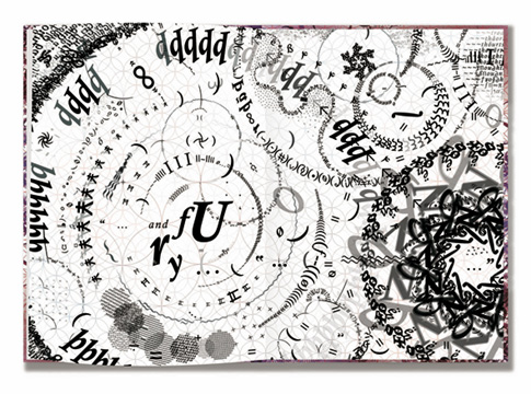
There is exquisite care taken in both books with the placement of letters; Ashby has painstakingly used screen and software, working with visible circular grids that underpin the page. The only horizontality is a quote from Shakespeare that offers ‘a kind of life line back to the surface of normal reading’. Beaulieu has no grid for his circular movements. He seems to start with a letter, perhaps any letter depending on the day, and muses his way along its anatomy: ascender to descender, bowl to bowl, over and over, pulled this way and that by line, curve, darkness and negative space. Ashby’s language is a system, cleanly yet lushly growing, chaotic yet tidily manufactured. Beaulieu embraces the faults and problems as his lettering stumbles: Letraset promises neat black letters but so often delivers crumbs, cracks and angsty imperfection, and makes you think that it’s all your fault. Others would patch, scratch off and start again to achieve a chimera of perfection. Here on the pages of Kern, the flaws are poetic, and part of that poetic is materiality. They are simultaneously charming and terrifying in what they imply, bringing us back to apocalypse.
This is not the first of Beaulieu’s Letraset volumes, and unless he runs out of his raw matter, it probably won’t be the last. With or without meaning, they are hypnotic, and more so if you try to retrace his movements through the patterns. The process must be consuming; the mystery of them is how, in any of them, he managed to stop. In that thought, I see the craft of the poet.
- Drucker, Johanna, 1996. ‘Experimental, Visual, and Concrete Poetry: A note on historical context and basic concepts’, in Experimental – Visual – Concrete: Avant-garde Poetry Since the 1960s. Amsterdam/Atlanta, GA, Rodopi: 46-47. ↩
- Ibid ↩
- Ashby, Lyn, 2011. Ideo(t) Grammatica. Australia: This Too Press. All quotes are from ‘The Hall of Mirrors’, a paper presented at the Melbourne Codex Australia symposium in March 2014. Thanks to Lyn for permission to reproduce images from his book. ↩