Report from a Border by Dan Disney and John Warwicker
light-trap press, 2016
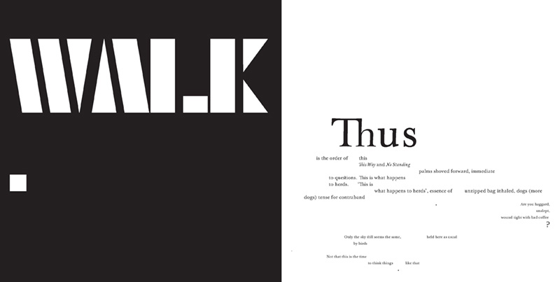
The book starts with a full stop. It orders me to stop before I begin. On the next page there is a font that looks like a zebra crossing. It straddles the page spread, white shapes on flat black. I stop, looking hard at the letters to make sense of them, and then realise what they’re saying: WALK WALK STOP! I’ve followed orders; how biddable of me. I move on, turning the page. There’s another black expanse: it says WALK in the same font, followed by a full stop. I guess I have permission to move on. So far, so good.
Let me offer the usual caveat for my contributions to this journal: I’m a printer, designer, artist, text lover. I’m going to respond to the visual agenda of Report from a Border, using some thick description. If you want to dig deeper into the poetry side – because Disney, as usual, has layered this work in multiple, dark and urgent directions – I highly recommend Dominique Hecq’s excellent launch speech.
I first opened Report from a Border on the day that Brussels Airport was terrorised by suicide bombers. In an interview at foam:e Dan Disney describes the book as ‘a speculative experimental narrative set in the near future’. It didn’t feel very speculative: it felt at first glance as though I’d received a direct transcript from one of the bomb survivors.
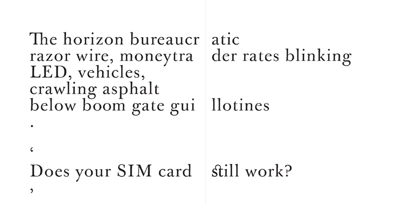
I’m plunged downwards into the space of this book THUS. Ligatures appear in the text; readers are accustomed these days to seeing discrete ligatures in our text such as ff, fi and fl, but these particular linked letters are archaic – ct, st – and the classical weight of the font spins me back to the golden age of typography, the Enlightenment, when printers were designers and designers were artists and printing was power. The letters fluctuate in size, words are allowed to float and grow and shrink alarmingly. I might be falling, heading for fantasy. No. My visa is checked at the entry. Instead of a rabbit hole I’m moving through a transit point, being told what to do, where to walk, and bombarded at every turn with text, both serviceable and decorative. THIS COULD GO EITHER WAY.
I’m looking at the large-scale version of the book, a proof copy of the deluxe version, sans the hand-printed cover (more on that in a moment), sized at a generous 300 x 300mm. You’re more likely to look at the still-limited but more attainable standard version (215 x 215mm), because there are fifty of those in the first edition, and only six of the former, which are sold out. Still, here I go: in grand scale, feeling privileged, and able to read the smallest print comfortably.
This is contemporary limited edition; the production markers are humbler than fine press limited editions. The text pages are printed digitally on a good matte paper, but it is still ‘perfect bound’ (such a misnomer! ). The deluxe dust-jacket adds a hat-tip to fine press work by incorporating a human touch – printed by one of the publishers, poet and artist Angela Gardner, using hand-set woodtype. And full disclosure here: she used my letterpress type, my press, and more pertinently, my offcuts of the flamboyantly-named yet sweetly dull grey-green Valentinoise Flanelle 300gsm paper. I only had a few pieces left, so I’m probably to blame that there were only six copies. I hadn’t seen the actual book-block or read any of the manuscript at the time of the cover’s printing, but I was keen to do so, as I’d seen some of Disney’s and Warwicker’s earlier work, and the intersection of their respective practices interests me greatly. John Warwicker is a graphic designer of repute; he has worked with poets before, and his visual explorations are often marked by an elegant use of the digitised Baskerville font. The additional intersection in this publication is that of the publisher, light-trap press. Angela and her partner, Kerry Kilner, publish limited edition volumes that consciously test the borders of poetry publishing, fine press publishing and artist’s books.
The generous amount of page space allotted this work is the distinguishing marker of luxury and poetry / art crossover. Report from a Border is square: it’s never going to sit neatly on your shelf of poetry books. It might nestle in with art monographs and catalogues, but it’s most comfortable on your coffee table, looking very sexy and sleek and designerly, asking you to spend time with it. The sting is that time spent in this book is not comfortable, and this is very deliberate (like all good design).
The book / page space is expansive and multi-directional. There is enough room for extremely long lines, and the type size is allowed to fluctuate radically; there is no doubt that when there are graphically awkward moments, they are there by design, because this is where the graphic design extends and enhances the reading experience.
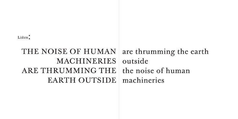
There are beautiful moments: THE NOISE OF HUMAN / MACHINERIES ARE / THRUMMING THE EARTH OUTSIDE / ARE THRUMMING THE EARTH / OUTSIDE / THE NOISE OF HUMAN / MACHINERIES. This spread has used the page gutter to stop your eyes even though the words seem to run across the full span of the page. There are clear graphic signals to help us: one page is capital letters; the other, all lower case. Even so, the eye can roll around and play, and the page spread rewards it. Else-where the page gutter is used like a stutter – sometimes in earlier pages a word will be split in half and flung across the page or chopped prematurely and lost – but here the page gutter is interfering, is a ditch to be jumped, sometimes halfway through a word. When the voice moves outwards from its seemingly internal monologue, two words amplify across the entire spread: HELLO. HELLO? The gutter suggests a reading of hell, even though the split isn’t deliberately doing so. It’s the physical plunge downwards, into the spine, and thankfully out again, resolving into a cry for connection.