Disney has worked with design elements before: multiple fonts, varying sizes, glyphs like arrows, rules and manicules. With Warwicker’s design, this work initially looks as though it uses myriad fonts, but in fact there are only three. Baskerville – designed in 1757 and one of the first fonts to be digitised, thanks to its excellent readability – is the bulk of the text. The two other fonts are contemporary and hard to name in the mosh of digital typefaces available to us, so I’ll describe them: the first is a stylised stencil font, rounded at the corners, evocative of both roughly-sprayed crate identifiers and smooth neon cocktail bar signs. The other uses small round dots: a fixed-proportion dot matrix display type, complete with lack of punctuation, instead using a generic F shape that flips to form opening and closing quote marks. Ever-present since the birth of electronic screens, and strangely timeless within that timespan, it is a perfect conceptual companion to the contemporary classicism of Baskerville.
These three fonts are, of course, voices − but whose?
There are orders. I walk tensely through some terse but elegant pages, and then there is another of these black-and-white spreads. The same font that was a walkway is now a stop sign: single letter G, broken into composite parts, follow through by a binary opposite black on white: GET DOWN FUCKERS. As authoritative as a road crossing, military orders barked out by security men: ROOM: HOSTILE. ROOM: HOSTILE. MOVE. MOVE. MOVE. This voice could be human or machine, and it continues – moving into the realm of typescript or transcript with the startling inclusion of a stage direction:
(INAUDIBLE). DOWN
Suddenly I’m informed that the next word is to be spoken by a man:
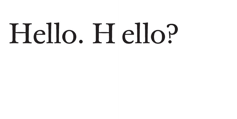
MAN: DOWN. CHECK.
GET DOWN FUCKERS.
ROOM: HOSTILE
Did the room say ‘hostile’?!
It’s a disorienting read. There are no page numbers, so you’re never quite sure where you are. The text sizes shift your reading eye into a listening ear, with words whispering close-up, shouting face to face and perhaps also from a great distance, as well as moving away rapidly. The first third of the book feels internal, over-sensory, experiential. An Event has happened, the kind of thing we all fear. Is our protagonist travelling or escaping? Is there a difference? Are they trapped in a revolution or in a refugee camp? Whose approval determines that difference? It feels like a sole experience, but there is a WE evoked on an early page, a sign of fellow humans moving through this space. There is an evacuation. And then it transforms into a survival story populated by others.
Halfway through, I feel fatigue. These words are visually overwhelming. It’s dense and frightening and I could stop now. But the nature of Book is to move through consecutively, to get to the end. This fatigue is akin to that feeling when you realise that there’s no easy way out, that things just have to get done, there’s no-one else to do it for you, and you’re a long way from home. It feels post-apocalyptic, a genre space where there is little resolution because the resolution is what happened first.
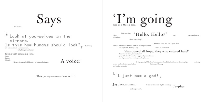
Suddenly there are characters, names: Jaypher, Doc, Anne, a group of young teenagers (‘tweens’). ‘Our’ voice is Nick; Doc is the dot matrix font, the political / philosophical / scientific voice of reason who is not using the Enlightened Baskerville like everyone else. The stylised stencil font is The Machine, the one that regularly THRUMS THE EARTH through the pages, the one that runs the Earth, Them as opposed to Us. There are pages of dialogue, running visually through the landscape of page space.
The punctuation is pivotal to the performance of this text. Each punctuation point works as grapheme, not just for pacing but as shorthand or stage direction for actual physical movement. They have independent sizing and positioning, and are signposts along the way.
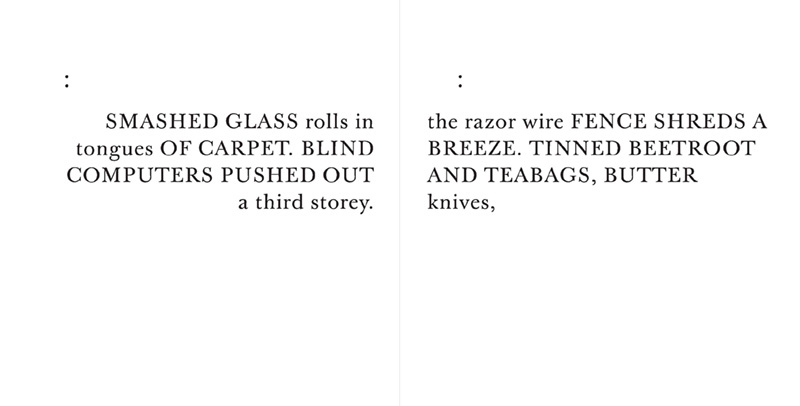
Here comes the pulse of colons again, one at the top of each page, followed by detail, like eyes flickering as the body moves. There is a closed parenthesis that hasn’t been opened and I finally understand that one of the machine noises is a helicopter. Tension is built with scale. Size does matter. The pages become a script that I am performing and yet the text is already performed for me − you would think that the typography is the acting but is we who act it out. Does that make sense? I’M GOING MAD AS A MARCH HARE. Maybe this is the rabbit hole. More pulsing of colons and shouting of caps. This typography is surprisingly restrained. It is all creative constraint: a palette of simple typefaces, scale and space. Yet it builds and builds and the mélange of voices and action is distressing, and of course it leads to violence. The tumult is broken by a white page, very clean. We are given a dot – full stop, as if the white-out hadn’t just done that – and then the words A VOICE: FOLLOWED? in stencil font. Oh, it is a voice. I think I followed all of this. The same formula is repeated over the page, space for space, word for word – except the answer is NOT FOLLOWED in dot matrix font … and then the tumult starts again. There is no resolution. It’s an aftermath, there is only relentlessness. It’s completely exhausting.
Disney is a philosopher-magpie-poet. He collects, gathers, winks, nods, suggests, refers, references and pays homage. What is happening here is that Warwicker is adding graphic references that ally with the poetic density; he’s using design knowledge built up from years of practice and visual research. It is a true collaboration, not an outsourced design job. There are obvious design/text intersections and influences: the work of French poet Stephane Mallarmé is one. Mallarmé’s 1897 constellated shipwreck, Un coup de dés jamais n’abolira le hazard, could not have been rendered to his exacting desires without the design knowledge of a professional printer. Within enforced typographic constraint (only one font with its limited point sizes and styles – roman, italic, bold – and the linear restrictions of the letterpress forme, no photographic reproduction or scalable fonts), the poem was ground-breaking in terms of spatial layout because Mallarmé used the page gutter – the space of the inner spine – as an integral part of the design, moving over, through and into it. Like him, Disney and Warwicker see page space as an interface, deep as well as wide, made for interaction and exploration. They can make this space whirl with text of any size and shape, and they run with that privilege. It’s a luxury that Mallarmé did not have, bestowed upon them by the very thing that this book positions as the enemy: technology, and the power to control via technology. I’m sure they are cognisant of the irony.