When contemplating writing a piece on graffiti typography for a journal of poetry review and criticism, I reflected on themes that could be extrapolated between the two. That is, beyond a shared use of the alphabet as fundamental building block for both creative practices. Of course, the term ‘graffiti’ finds its etymology in the Greek work ‘graphien’, meaning ‘to write’, but parallel language used in the seemingly disparate worlds of literature and graffiti art extends well into a contemporary context. Within their own community, graffiti artists are referred to as writers and the more complex artworks they create are known as pieces. When enquiring about their creative practice, a graffiti artist will be asked what do you write?
Most readers will be familiar with wild style graffiti, originating in the South Bronx, New York City in the 1970s and 1980s and made famous in a popular cultural context via music videos, cult films, and eventually, advertising and marketing. However, this is arguably the moment graffiti entered the mainstream. There is a history that extends well before, and well beyond the zeitgeist of letterform based graffiti in the early 1980s.
Traditionally, literary pursuit is neither a public nor a shared activity. Rather it is located in the private and individual spaces of the home, studio, library or classroom for scholarship and leisure. The written word actively located in public space, however, assumes the role of announcement or provocation and, by nature of being viewed by the community, is transformed into communal experience. This essay will explore several text based graffiti practitioners who span history, geography, art movement, style and intent … but who are inextricably linked by the practice of placing text as image (and image as text) within the public sphere.
Shout Eternity through the streets of Sydney
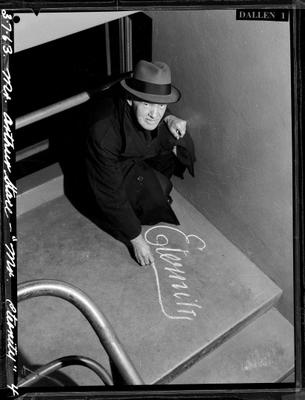
For a period of more than three decades, beginning in 1932, the cryptic message ‘Eternity’ appeared on the pavements of Sydney . Marked in chalk and rendered in an elegant 19th Century Copperplate script, the perfectly formed Eternity was at once iconic (resembling a mass produced logo that remains effective to this day) and mysterious in its meaning. Eternal life? Eternal love? Eternally damned? The reader could only guess at the intent of the writer. Specifically, the reader could only interpret the meaning of Eternity, an incredibly loaded word placed deliberately in the quotidian context of the street, subjectively. One can imagine that the possible interpretations for the word Eternity would have been as variable as there were members of the general public moving through the streets of Sydney in the 1930s and 1940s.
It wasn’t until 1956 that reformed alcoholic and devout Christian, Arthur Stace, was revealed to be the writer in an article in the Sunday Telegraph. Stace recounted hearing a sermon delivered by popular evangelist John G Ridley in late 1932. Ridley preached:
Eternity, Eternity, I wish I could sound or shout ETERNITY through the streets of Sydney … You’ve got to meet it, where will you spend Eternity?
Stace was inspired to perpetuate Ridley’s message as a ‘one word sermon’, metaphorically shouting Eternity through the streets of Sydney. He reported that his motivation was a spiritual one:
I felt a powerful call from the Lord to write ‘Eternity’. I had a piece of chalk in my pocket, and I bent down right there and wrote it’; ‘I’ve been writing it at least 50 times a day ever since.
Perhaps more remarkable than Stace’s core message, however, is the inexplicable visual form it took. Raised by alcoholic parents in inner city Sydney during the Great Depression, Stace had very little schooling and was, by all accounts, illiterate. He claimed his usual handwriting was illegible and that he could barely spell his own name, crediting the Copperplate script with which he wrote Eternity to divine intervention. In Stace’s own words, ‘I tried and tried but Eternity is the only word that comes out in Copperplate’.
His rendering of the word was so ubiquitous and perfectly formed that it has become an Australian design icon more than 80 years since it first appeared on the footpaths of Sydney. The National Museum of Australia in Canberra, which holds an original example of Stace’s chalked Eternity in its collection, has named a permanent exhibition (exploring the lives of Australians), Eternity: Stories from the Emotional Heart of Australia. The iconic word, rendered in its original Copperplate, has featured on numerous items in museum gift shops, such is its success as a graphic logo and marketing tool. It’s reported that Stace wrote Eternity on Sydney’s pavements more than half a million times between 1932 and 1966 before his death in 1967.
SAMO© as an alternative …
In 1978, another kind of cryptic messaging appeared on the walls of downtown Manhattan in New York City, bearing the faux-copyrighted name, SAMO©. With the mysterious SAMO© placing itself, alternately, as author and subject, corporation and individual, the statements were brief, provocative, political and critical of the status quo. Scratched into existing paintwork, scrawled in permanent marker on doors, or sprayed in aerosol across walls, the SAMO© graffiti critiqued, not only the gentrification process sweeping SoHo and the Lower East Side, but also the new demographic of people moving into the area . The local residents were SAMO©’s immediate audience.