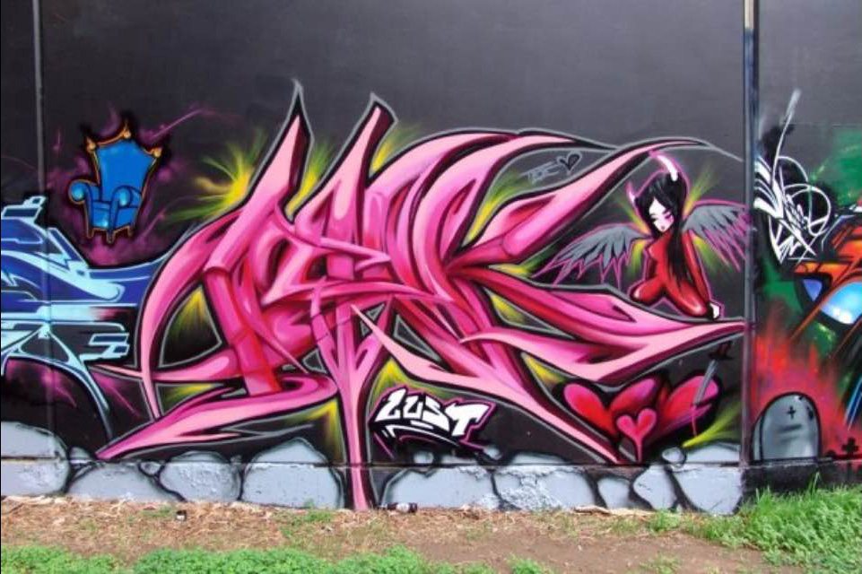
Nish says that her style evolved to its present form as a result of two factors: frustration, and not being able to execute a clean piece using the standard formula of fill, 3D, outline, key line and background. ‘When I (used the standard formula), it was so flat and boring,’ she says, ‘I wasn’t content following the rules, so I started to experiment with colour and stepped away from the usual way of developing a piece.’
Eventually Nish started to dabble in 3D techniques which gave her an opportunity to focus on the fill and work on creating movement in her lettering. By dropping the outline, she went on to develop her own formula. She says she struggled slightly with clean straight lines, so she focussed on working to her strengths instead – the more variations and tones of the colours she used, the more movement she was able to convey.

I looked at each letter as an object and started pulling the letters apart, stretching and twisting them but still making sure that each letter connected into the next. Eventually I built my style into what it is today. I like to think my work is a constant conflict of contradictions, reflecting both hard and soft, a hybrid of 3D/2D styles, organic and soft but sharp and angular letters defined by colours − and bending those colours to create movement rather than a static piece.
Nish’s characters primarily depict the female form but she is concerned with showing both femininity and strength through opposing forces − in her own words, ‘soft and hard, light and dark, feminine and masculine, sexy and strong, bad ass but innocent’. The philosophy of yin and yang is integral to her ideas and she is guided by this principle, particularly in her work.
Recently asked by a random passer-by, ‘what does it mean’?, Nish’s response is that, generally, graffiti art isn’t created with the general public in mind, rather it is about connecting with other writers and communicating via the streets as a social means. She explains:
I started out taking pics of graffiti in the 90s when style was a big part of it and I learnt to ‘read’ the letters and find the connections. It was an exciting time for Adelaide and Australia in general. Style was everything and it was still an underground movement which made it even more enticing! I look back and see an evolution of my style which is interesting to look at. Ishk is 4 letters which I’ve managed to interlock and I like the way they connect. Another play on those letters after googling the word Ishk is an acronym for the Institute of Study for Human Knowledge − something that blew my mind as it characterises my life’s quest!
‘Nish’ is her nickname and was the obvious cornerstone for her tag. She sees ‘Nish’ as her professional personality, used in the formal graffiti writing workshops she conducts. ‘ISHK’ on the other hand, is her street persona. Like the contradiction and duality that inhabit her pieces, Nish’s says the dual graffiti ‘personalities’ reflected in each pseudonym sum up her ‘crazy personality’.
When I asked Nish where she sees herself sitting along the trajectory of graffiti history/herstory, she was unsure. However, she hopes, by breaking the norms, that she can inspire young women to paint and be individual in their expression. She recalls that when she started painting in 1995, some 20 years ago now, there were two women who served as an inspiration for her (and still do): Poise and Spice. In addition to her own individual practice, Nish has contributed to Australian graffiti history/herstory by helping to spearhead the Ladie Killerz event, Australia’s first ever female graffiti jam. The event was spawned by a group of women who not only formed the Ladie Killerz crew, but who remain close friends drawn together by a passion for graffiti and a fierce sense of integrity with regard to the artform.
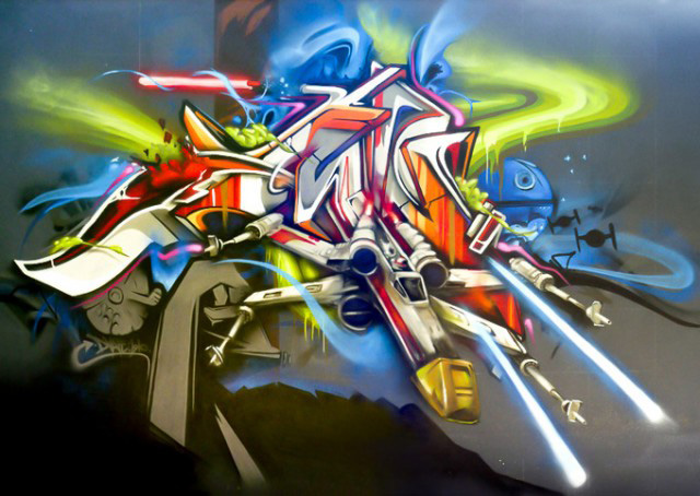
Dvate’s style has also evolved over time. His work is based on early and local influences, what he observed growing up, who he painted alongside, and the styles of graffiti that appeal to him. Dvate describes his style as semi-wildstyle / abstract depending on what he paints.
I try to mix up my styles to keep it interesting. My style has classic New York / Melbourne roots in terms of composition and form – with a mix of more modern graffuturism / abstract styles that have come out of Europe.’
When asked whether abstracting the alphabet beyond recognition is the end goal for graffiti writers, Dvate explained that every writer has different goals. For him, it’s about painting what he likes. He explains, ‘the whole point of Graff is to give style to a letter, so if it becomes illegible then it loses its point … even if it’s only legible for a select audience’. Abstracted letter styles are the natural progression as writers look for new ways to express their name − taking influences from other sources and adapting them to their own pieces.
Incorporating images into his pieces, Dvate is quick to clarify that all of his work ‘says something’ even if the viewer reads it as totally abstract . ‘There will always be at least a letter or a cropped section included’, he says. ‘I guess the works I did with no outline − like the huge wall between Clifton Hill and Westgarth alongside the train line − are the furthest from traditional graffiti process that I do, but (they) are still very legible to me.’

Acknowledgements: A special thank you to KAB101, Nish Cash and Dvate for their generous time and contribution, making this article possible.


