At a time when the large, colourful, ostentatious, wild style graffiti was flourishing in the Bronx and on the railcars that passed through it, the visually rudimentary and deeply political SAMO© graffiti appearing in downtown Manhattan was its very antithesis. Despite its basic and unadorned rendering, the SAMO© graffiti exemplified unique elements that signified a strong sense of identity: the copyright symbol, the capitalisation, the E represented by three horizontal lines, the use of 2 (to) and U (you), and the use of ‘slugs’ (found in magnetic printing) as punctuation . Framed in a contemporary context, SAMO©’s stylised, one line statements could be read as the text-based Facebook status updates prevalent in the mid-2000s.
SAMO AS AN ALTER-NATIVE TO BULLSHIT FAKE HAPPY WHACK CHEER….
SAMO… AS AN END TO THE * POLICE….
SAMO© 4 THE INDIRECTLY INVOLVED, THE EASILY CONVINCED & THE BAFFLED
SAMO© 4 THE RICH BOY
SAMO© 4 THE SEDATE
SAMO© ANOTHER DAY ANOTHER DIME HYPER COOL ANOTHER WAY 2 KILL SOME TIME
SAMO© ANTI-ART! # xxxx
SAMO© AS A CONGLOMERATE OF DORMANT-GENIOUS
SAMO© AS A NEO ART FORM
SAMO© AS A REALIZATION PROCESS
SAMO© AS A RESULT OF OVEREXPOSURE
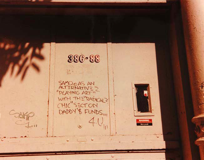
SAMO© AS AN ALTERNATIVE 2 ‘PLAYING ART’ WITH THE ‘RADICAL? CHIC’ SECT ON DADDY’$ FUNDS 4 U
SAMO© AS AN ALTERNATIVE TO BOOSH-WAH-ZEE FANTASIES… THINK
SAMO© AS AN ALTERNATIVE TO PLASTIC FOOD STANDS…
SAMO© AS AN ALTERNATIVE TO THE ‘MEAT PACK’ ARTEEST ON DISPLAY ‘COME HOME WITH ME TO-NITE’ ‘I’M A DIVORCEE BLUES’
SAMO© AS AN END
SAMO© AS AN END 2 AMOS ‘N ANDY 1984
SAMO© AS AN END 2 CONFINING ART TERMS
SAMO© AS AN END 2 NINE-2-FIVE NONSENSE… WASTIN’ YOUR LIFE 2 MAKE ENDS MEET… TO GO HOME AT NIGHT TO YOUR COLOR T.V.
SAMO© AS AN END 2 THE NEON FANTASY CALLED ‘LIFE’
SAMO© AS AN END 2 VINYL PUNKERY
SAMO© AS AN END TO ALL THIS MEDIOCRE ART
SAMO© AS AN END TO BOOSH-WAH-ZEE FANTASIES
SAMO© AS AN END TO MASS MINDLESSNESS
SAMO© AS AN END TO MINDWASH RELIGION, NOWHERE POLITICS AND BOGUS PHILOSOPHY
SAMO© AS AN END TO PIN-HEAD EXCUSES
SAMO© AS AN END TO SAFETY PIN RIPPED JEANS & OTHER HIP ITEMS – THINK
SAMO© AS AN END TO SEXUAL MUTANTS & MICRO-WAVE EXISTANCE
SAMO© AS AN END TO THE 9-TO-5, WENT 2 COLLEGE, NOT 2-NITE HONEY BLUZ. SAMO© 4-U
SAMO© AS AN ESCAPE CLAUSE – THINK
SAMO© AS AN EX-PRESSION OF SPIRITUAL LOVE
SAMO© DOES NOT CAUSE CANCER IN LABORATORY ANIMALS
SAMO© FOR ALL
SAMO© FOR THE PEA-BRAINED SECT…
SAMO© FOR THE PHONY
SAMO© FOR THE SO CALLED AVANT GARDE
SAMO© FOR THE URBAN RED-NECK
SAMO© IT’S A GONZO’S WORLD… AIN’T IT SAD?
SAMO© JUST IN CASE
SAMO© SAVES IDIOTS AND GONZOIDS*
SAMO©? DO I HAVE 2 SPELL IT OUT!!
SAMO©…@*!?@!
SAMO©…4 MASS MEDIA MINDWASH
SAMO© IS DEAD
The hand that wrote SAMO© was, in fact, a collective of three individuals claiming responsibility for the graffiti: Jean-Michel Basquiat, Shannon Dawson and Al Diaz, beginning in 1978 when Basquiat and Diaz attended the same highschool . However, incomplete and reductive reporting of the SAMO© graffiti often attributes it to Basquiat as the individual creator.
Due to his meteoric rise in the New York downtown art scene in the 1980s (and subsequent tragic death in 1988 aged just 27), Basquiat attracted plenty of media attention. He was featured in televised interviews, was the subject of several film projects, and was photographed executing SAMO©-style graffiti . In addition to his highly successful painting career, Basquiat remains synonymous with SAMO© − so much so that downloadable digital fonts resembling the SAMO© letter styles bear the Basquiat name.
The Message: Contemporary Australian Graffiti
Contemporary graffiti practice is prevalent across Australia with a particularly strong presence in Melbourne and Adelaide. Originating from the traditional New York wild style emulated by Australian graffiti writers in the 1980s, abstracted letter styles have been constantly reworked and have evolved into the contemporary graffiti styles found across Australia today.
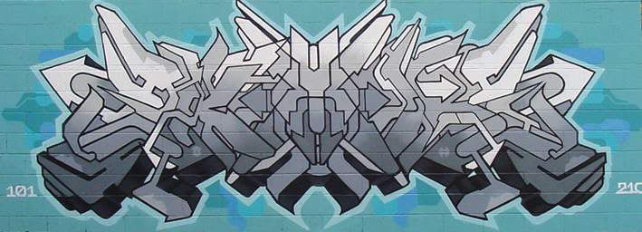
KAB101 has a range of distinctive styles that can be broadly divided into two camps: abstracted letter styles and calligraphy. New York subway writing was the inspiration for his early work, but he quickly developed his own interpretation of letter design.
Originally he started writing his name, using marker and spray paint, producing tags and simple pieces. Over time, however, his style of painting his name became more technical and his abstracted lettering developed beyond what is known as public (readable) style. KAB101 says that when he picked up a brush (to experiment with a calligraphic style) in the late 1990s, he was emulating the tags and signatures traditionally created with a marker chisel tip found throughout his creative oeuvre.
With a brush, I found I could achieve a different form of signature writing. It allowed me to adapt connections of style (i.e. extensions of lettering) with flow. Writing was always tags and pieces − now I do my tags in a calligraphic style. Each has their merits yet I have come full circle back to the tag/signature – the basis of writing. The calligraphy is a more flowing style (whereas) my abstract letters have a harder edged design.
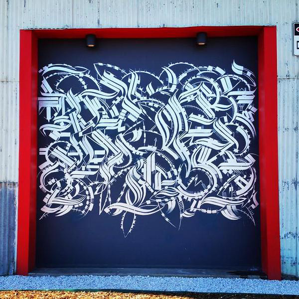
KAB101’s stylised calligraphy presents as indecipherable text − as if it were a foreign language, or merely pattern that gives the illusion of language, evoking meaning where there is none . To the graffiti writers who create the works, however, every piece is meaningful. ‘It’s usually name-based but not limited to that’ KAB101 says. He explains further:
I sometimes include messages, small images and symbols. Some extensions or connections that join the letters may sometimes take on a pattern effect but there is always a name/message and meaning. I just don’t explain what the signature is about. I find it’s a personal way of writing as it’s focused on my own ideals.
KAB101’s goal is to develop styles that sit well with his notion of construction. He acknowledges that some letter styles may become overtly abstract, but he is more concerned with balance and flow essential to the piece . I asked him if abstracted lettering was used to ‘code’ meaning, making it readable to other writers, but not the general public − a secret language if you will. KAB101 agreed that there is an element of codifying that is decipherable only to others in the graffiti community, but he suspects that his calligraphy sits outside of that sphere:
I don’t think a lot of writers know what my calligraphic works say directly. It’s probably easier for writers to decipher the aerosol based lettering as they recognise the style. With my calligraphy, the design of letters are differently put together.
He says his most abstracted works are the pieces in which he replaces letters with symbols that mimic the basis of lettering attributes. He also uses a series of names that recur like motifs throughout his writing career – some have never been recognised by other writers, some are unknown, and some represent figures that were integral to his progression as an artist. He still uses these obscured names and numerals today.