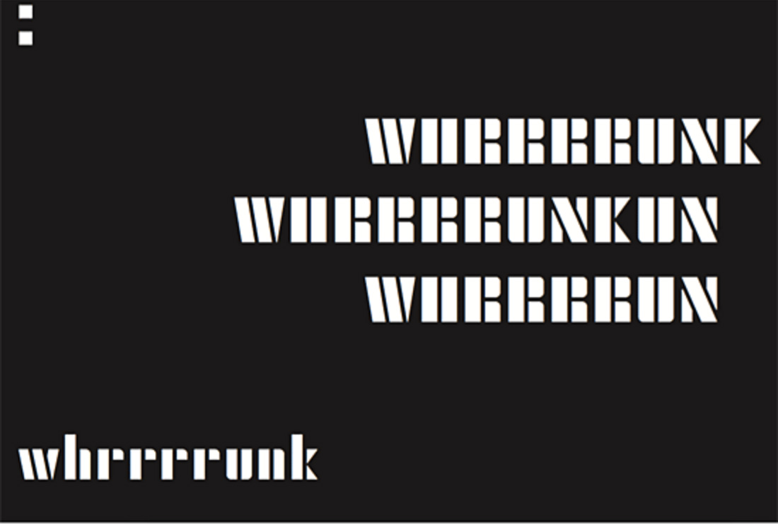
At the risk of generalising, I find this kind of graphic poetry experimentation the polar opposite of earlier language art / concrete poetry intersections. Much graphic layout from the 1960s onwards seemed to fetishise a scientific approach; making emotions into formulae, giving out instructions to democratise poetic action, setting up patterns and shapes, seemingly trying to bond people but actually setting up a dichotomy of thinkers and doers. The neutrality of font choices (an ‘objective’ sans serif or a fixed-space typewriter font) pretended that a cold hard voice was not a personality.
Disney and Warwicker are working in a more humanist way – and this is for me one of the biggest dogwhistles of the Baskerville usage – performing the text and urging participation in the performance by the reader, bringing back a sense of voice, staging and artifice. It’s contemporary, but not in a dehumanised Helvetica sense; it’s multi-figured, multi-toned, shocking and yet entertaining. The layout is proscriptive but so are the words it is working with, the situations that have been set up. This book is about control and escape, survival and uncon-trollability. It is about the transience of power and the intransience of the human project.

WHRRRRRUNK. There is a line that repeats. In fact, there are a number of lines that repeat. THE NOISE OF HUMAN MACHINERIES ARE THRUMMING THE EARTH OUTSIDE. That is the last line. White page. Black page spread. Colophon. I close the back cover and feel silence.


