Available by print-on-demand, asemic 15 includes 146 black and white illustrations by 44 artists across 120 A5 pages. The magazine appears to embrace all levels of endeavour in this field. In some pages, it can be difficult to see where one work finishes and another begins, as some pages illustrate up to three works. The only indication of authorship provided are initials at the bottom of the pages, and a single line for each producer at the back of the book. There are no details regarding individual works, such as dates, titles, medium, or dimensions. Such details may not feel relevant for some of the practitioners, particularly for those who have previously participated in the field of mail art. In the case of the cover artwork, however, it is given a title on the artist Satu Kaikkonen’s own website.
The compacted design suggests a cross-pollination of ideas, or perhaps it is a reflection of the influence of screen culture, a hangover from the absorbing multiplicity of the internet, where there are often conflicting demands for attention within one screen. On the other hand, in the context of textual production, the magazine’s layout inhibits readers’ navigation and attribution of authorship.
Despite this, many of the artists / writers are published multiple times across issues of the magazine. Most are from Europe, America and Australia. It is possible to identify over a dozen females out of the 44 practitioners, and of that dozen less than half have their names/information listed on public sites. From the information that is available publicly online, the majority of the writers/artists have a diverse creative practice covering areas such as visual art, mail art, spoken word, poetry, vispoems, poemics, abstract comics, graphic design, music, and architecture. Some artists clearly embrace asemic writing, using the term to describe their own work; others are less clear as to how they contextualise their own practice.
The magazine has not included details about the breadth of its contents’ processes and technological manipulations, which might have given greater insight to the relationship between materiality, language and technology. Looking at the reproductions within, there are both works that appear to utilise traditional art mediums such as pencils, inks and paper, and others that blend these traditional methods of mark-making through contemporary modalities that draw on digital technologies. Still others may create work all within the confines of particular computer programs. Practitioners such as Mike Di Tommaso, Roy Arenella, Miron Tee and Jeff Crouch appear to use digital technologies to create their works. Constança Lucas may well have used traditional methods, however, from looking at the black and white reproductions in the magazine it is difficult to tell. She could also have created these three works with a computer drawing program where lines cross over each other more than once, therefore encircling a space that is then filled with colour. These works are some of the few in the magazine that are illustrative, having a 1950s block print quality. A page illustrating a plant also encompasses visual references to text. In the bottom right hand corner of the page these rounded linear shapes could also double as the plant’s shadow. This opens the viewer to consider the relationship between the image or perhaps nature, and the remnants of writing.
Serse Luigetti has used a series of boxes to contain his work. In the top right-hand box, the word ‘paper’ and the dates 1987-2008 appear from collaged text. This encourages the viewer to ‘read’ the work from the left. This work looks as though it has been produced by using a scanner. The stretching of shapes look like close-ups of the first right-hand box. There are subtle nuances to these fairly minimal areas of black and white. They could be viewed as a tussle between the text and its relationship to being reproduced. There are definite references to the printed word and particular reproductive printing processes.
Text and visual poet Sheila E Murphy has five diverse works in asemic 15. One of them reminds me of the text paintings by Tehran artist, Azra Aghighi Bakhshayeshi. The similarity is not so much in the style of script but in the way the scale of the text expands as it reaches the edges of the work. Another of Murphy’s works has a more definite digital feel. Unlike Lucas’s ‘filled in’ look, this conglomerate of independent curved and straight-lined shapes assembled in a non-linear fashion, reminds me of fluorescent signage as they are comprised of outlines. Here, too, a sense of shadow has been created by double printing the shapes in a darker tone. On closer inspection, anomalies in the paint / ink, where dark and light tones interact, give the work an analogue quality. Both coloured lines appear compromised when they touch, becoming narrower to produce deviated markings that emphasise an interaction of layers.
There are practitioners such as Ronald D Isom, Emma Viguier and Rob Grant who use singular tools such as pen or ink. Emma Vigiur’s work explores the notion of pre-language, in her 2010 essay: ‘Henri Michaux: a la recherché du “Texte primordial”’. Vigiur describes Michaux’s work (one of the forefathers of asemic writing according to Tim Gaze), as ‘remnant fantasies of the original text … a visual nostalgia of the pre-scriptures … The sign thus disengaged revives body: plastic body, rhythmic body, body energy, moving body … to find the body, to find oneself.’ Vigiur places the concept of replicating the origins of writing as illusory. Instead, Michaux has created work that is connected to his unique ability to translate his own particular somatic language.
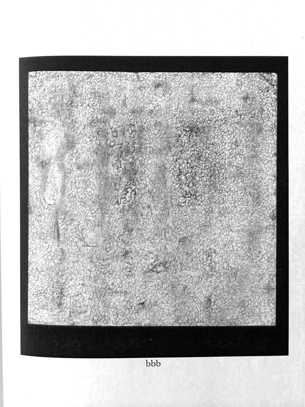
American artist, Billy Bob Beamer has three pencil works in the magazine. When I first came across these pictures I assumed the scale must have been reduced significantly: the artist describes them on public sites as approximately the size of two post-it notes. Each work consists of hundreds of miniature irregular circles drawn with what looks like a soft unsharpened pencil. The space within the circles is equivalent to the space that lies outside them.
It is difficult to see for the reproductive quality, but for the most part between the beginning and the end of each circle, however minutely, the hand has been left in free fall. Occasionally the circles are left unfinished. There are areas of darker marks produced by increased pressure and areas produced by a lightness of touch. One may relate to these circles as a verbal sound (‘o’) or perhaps notions around the meaning of the numerical ‘0’. What seems complete about these works is the obsessive commitment to the process of minute mark making, and in doing so, exposing tensions and vulnerabilities. It is interesting to note that this artist had been creating this work for many years before encountering the asemic community online.
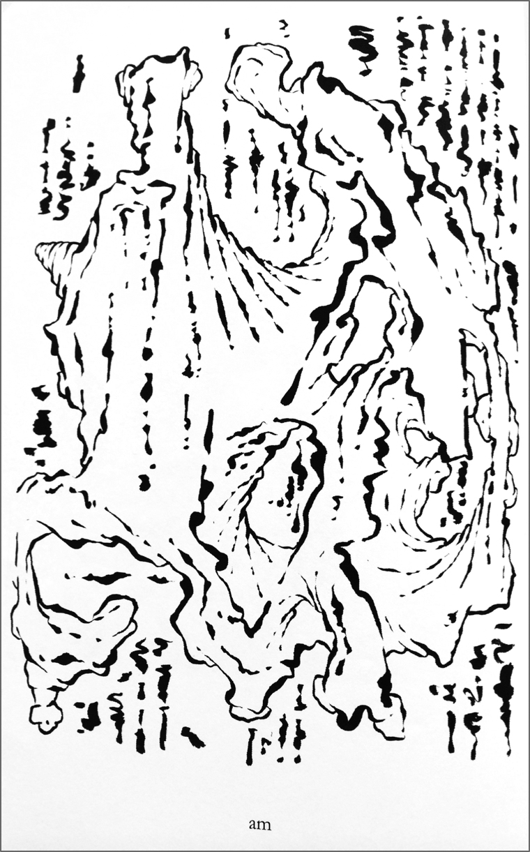
Andrei Molotiu’s works are made using what looks like a black inked calligraphy brush. I would have loved to see these works sitting next to one another so as to witness the dynamic range within them, rather than finding them dispersed throughout the magazine. For the most part, they are comprised of broken linear markings. In between these breaking points, the pressure on the page by the brush looks like it is increased and decreased in quick succession, giving the impression that the marks are moving. In parts, these linear marks curve and give form to shapes. There is an inference that these shapes are metamorphosing into three-dimensional nodular fluid forms.