
Twenty years ago, if you published a quarterly literary journal, you could be certain what that meant: four issues a year. In 2003, when Anna Hedigan wrote her overview of journals and their web presence not much had changed. The publishers’ attitude to the online space was that it was essentially a placeholder for the print journal.
Genevieve Tucker’s review four years later suggested many of the journals were becoming more sophisticated, with more content online and greater interest in design. Relevant to the 2007 review, RMIT publishing announced in September that it had partnered to produce a comprehensive digital archive of Australia’s most iconic literary and cultural journals
. This initiative will provide full archives for a number of Australian literary journals.
Tucker’s review was written at the nascent of Facebook and Twitter. Nowadays, every print journal is represented on Facebook and most have Twitter accounts.
Additionally, we’ve seen the mass marketing of ebook readers and ebooks with expectations that journals also meet this demand. The embracement of smart phones and tablet readers has also created additional ways of reading the journals’ online presence (though only one journal, Southerly, catered via their website template to a small device reader and even this had technological problems).
With these additional demands, running a quarterly literary journal in 2011 means doing everything you did twenty years ago, plus updating Facebook regularly, tweeting constantly, creating or sourcing blog content, building websites that support multiple devices, producing video content, making podcasts, publishing the journal in multiple formats, writing a regular enewsletter, and, on top of all this, coordinating these efforts. With funding bodies now expecting this output, this model is the new baseline.
These new requirements, however, mean new staff with more skills.
Take, for illustration, Australian Book Review’s recent call for a publishing intern. Among the responsibilities listed were:
- editing material and proofreading the magazine
- creating each issue of ABR Online Edition (Joomla CMS enabled)
- social media engagement (Facebook, Twitter)
- writing reviews and blog articles
So what does this mean for publishers? What does it mean for journals?
Prior to being saved by the Australia Council, the Premier of Tasmania cut $60,000 of funding to Island on the grounds that there was a “trend” towards online rather than hard-copy publications for literature
. As it stands, the only Literature organisations now funded by Arts Tasmania [PDF] are the Tasmania Writers’ Centre, the Tasmania Poetry Festival (a mere $6000) and The Australian Script Centre (funding to deliver a program to take the organisation’s digital publishing and e-commerce enterprise to the next level
).
The greatest cost in literary journals is the labour; moving to new electronic formats and social media creates more work, and the labour involved is largely invisible to funding bodies and readers with raised expectations. Even if journals stopped printing hard copy versions, this new world of online labour and additional skills is mostly irreversible.
Literary journal audiences are small, they always have been. Smaller still is the Australian audience. If the work put into the electronic versions and websites can attract and retain international audiences, it may well be worth the effort and cost spent online. It seems to me, at least, that this will also require an attempt to engage international audiences and stronger journal identities.
So how are they doing? Under the circumstances it seems unfair to criticise but, honestly, they could be doing better.
Communicating
While most have a Facebook page, not every journal’s website links to the page or the links were hidden within the site. The same was true for Twitter. Some of these social media accounts were found accidentally (while I was looking at another journal’s page) or through direct searches.
The Australian Council research Connecting:// arts audiences online reveals some reader behaviour, namely, not all social media are equal. Facebook has much higher usage rates than Twitter (though among arts audiences, it is the literary audiences that use Twitter the most). To publicise events and communicate information, the Australia Council found the most successful way of interacting with audiences is through enewsletters.
A word on content
The first rule of writing for the web is you do not write ‘click here’. The second rule of writing for the web is you do not write ‘click here’.
I observed this trend in many of the journals websites, so want to stress this as a general point about writing links. Links that appear as ‘here’ and ‘click here’ are bad for readability, scanability and accessibility (for readers who use screen readers). They lead to verbosity and a lack of clarity. The equivalent in an essay would read:
… as Anna Hedigan argued in her survey of Australian journals on the web. (Look at the bottom of the page for the footnote)[3]
Or for clarity it is the equivalent of marking toilet doors with ‘here’ and having to look at another sign for directions. ‘The men’s toilet? That’s the one on the left with the sign “here”’.
Web platforms
In regards to web platforms, the majority of journals use WordPress (Going Down Swinging, HEAT, Southerly, Overland, Peril and Voiceworks) and Joomla (ABR, Griffith Review). Island uses inScribe Content Management System. The only non-PHP CMS was Inventive Labs’s Blueprint used by Meanjin. Surprisingly, one print journal (Wet Ink) and two ejournals (foam:e and Mascara Literary Review) didn’t appear to use a CMS at all.
Searches on these websites were rarely effective. Often, this is because of the technological limitation of these platforms, so it really highlights the need to have well-designed site structures.
None of the journals used metadata well. Given schema.org and other big projects to increase use of metadata, it will be interesting to see how this might change in future.
Now for this year’s review.
Print journals
Australian Book Review
- Website:
- www.australianbookreview.com.au
- australianbookreviewblog.blogspot.com
- Facebook:
- www.facebook.com/AustralianBookReview
- Twitter:
- @austbookreview
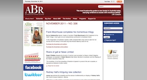
The ABR website, understandably, wants to sell you its current edition; there are three links each to the print and online editions on the homepage. The online version is a paywalled version of the print edition. Readers can subscribe per month or per year.
Facebook and Twitter links, and newsletter sign-up, all appear in the sidebar. Their Twitter is rarely used but Facebook is regularly updated. Tying the two together would seem logical, both to broaden the audience and to provide ABR updates, something the website doesn’t really cover.
Online subscribers can access the current edition and back issues until December 2010. Author names are linked to author pages, which list other ABR articles by that author. Unfortunately there isn’t a way to list based on the type of content e.g. just the fiction reviews or just the poetry.
The ‘About ABR’ section covers most of the important information, including a link to an external blog. It’s also very easy to buy print and online access directly from the site.
I’m not a fan of the ABR design; it feels blocky. It doesn’t have an onsite blog and there isn’t an events page – so why would people visit regularly? The external blog, ‘From the Editor’s Desk’, hasn’t been updated since January 2011.
Unfortunately, there is no special design for smaller screen sizes, so it doesn’t render well for iPhones and iPads. Worse, though, is that some of the menu items don’t work with these devices, making sections of the website impossible to navigate.
Going Down Swinging
- Website:
- www.goingdownswinging.org.au
- Facebook:
- www.facebook.com/goingdownswinging
- Twitter:
- @swingingonline
There was a flurry of excitement when Going Down Swinging released an e-version earlier this year. Perhaps a little large filewise, it did show some of the potential of working with audio and video. Rosanna Beatrice Steven’s musical translation of Dorothy Porter’s ‘Nefertiti Rides Me’ and its discussion in ‘The Sound of Reading: Translating the Written Word to Music’ was particularly engaging.
GDS tackled the problem of poetry flow in ebooks by setting the poems as images. I’m not certain this is the best approach as it means the text won’t resize or be read aloud, thus losing the textual nature of the poem.
However, the e-issue was a standalone and it is now back to print and CD for GDS.
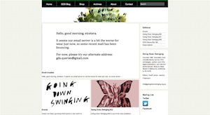
In general, GDS’s online presence is looking a little neglected. Their Facebook and Twitter can go weeks without being updated; their website itself is slightly messy, with broken tags appearing among the content. There are no dates on posts so visiting the site can be disorientating. The blog itself operates more as a newsfeed. There is no mobile specific layout, which is fine for an iPad, but involves some scrolling around on a phone.
Visitors can buy back issues and subscribe from a separate site.
Griffith Review

- Website:
- griffithreview.com
- Facebook:
- www.facebook.com/pages/Griffith-REVIEW/59242722420
- Twitter:
- @GriffithREVIEW
Another site that has evolved since the last review, Griffith Review now has its own dedicated URL. It’s easy to buy and see sample content from all previous editions, and current editions are available as print, EPUB, PDF or EPUB and PDF on a very attractive USB card.
Subscribers can log in to update subscription information or check their status. One of the terrific features is being able to view all the contributors and see what they’ve written for Griffith Review. But, as with ABR, you can’t search the content by type. I typed poetry directly into the address bar and received a smart ‘can’t find that page!’ error that went on to list the poetry sections of the last few editions. Given that, it would be nice for these features to be directly built in.
Their Facebook and Twitter is regular and conversational (a must!).
Absent is a blog. There’s a ‘Discussion section’, which basically consists of letters to the editor from the print edition. There is a podcast archive that claims ‘contributors are regularly involved in discussion panels’, yet hasn’t been updated since 2009.
The site doesn’t allow for mobile or small screen styling. On the whole, I’m not a fan of the design and there is a grave misuse of underlining (Third rule for writing for the web: never use underlining unless it’s a link).
HEAT
- Website:
- giramondopublishing.com/heat/
- giramondopublishing.com/heatpoetryonline/
- Facebook:
- www.facebook.com/pages/HEAT-Literary-Journal/170880023783
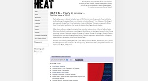
Although HEAT in print has exited stage left I wanted to cover it briefly. There is a solemnity to holding HEAT 24, like standing at the end of a one-way street or visiting a website that hasn’t been updated in a decade. Something final about something that shouldn’t end – streets, journals, websites. This is the tragedy caused by the weight of the electronic; audiences are deprived of HEAT, one of my favourite literary journals.
I understand it’s in the stages of being resurrected electronically and in the meantime there is HEAT poetry online. I am both hopeful after reading Ivor Indyk’s editorial, yet also worried given the history of HEAT’s online engagement. They used to publish journal extracts online and allow for easy purchase but it ended there. The descriptions of back issues were large blocks of texts and the journal’s identity, rightly or wrongly, was tied to Giramondo through a non-unique URL.
HEAT poetry online does not fare much better. It publishes irregularly and only single long reviews. Don’t get me wrong, I think long poetry reviews are important—it is the amount and the irregularity I have an issue with.
I still have my fingers crossed for an electronic HEAT.
Island
- Website:
- www.islandmag.com
- isletonline.blogspot.com
- islet.com.au (redirects to www.islandmag.com/im/index.php?c=61)
- Facebook:
- www.facebook.com/pages/Island-Magazine/228269357186170
- www.facebook.com/pages/Islet/308980005065
- Twitter:
- @IslandMagTas
- @IsletOnline
Island is still going strong even after the bizarre decision by Arts Tasmania to cut its funding because why would they fund a Tasmanian magazine when Tasmanians can go online and read the New Yorker
.
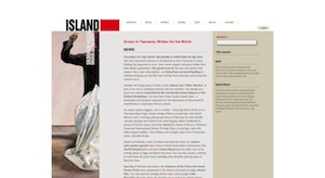
Island’s web presence, however, is everywhere and, in this instance, I’m not sure it’s a good thing. On the site, it is difficult to find the link to the Island Twitter account and impossible to find a link to their Facebook page. This is in contrast with Islet, their online journal for emerging writers, where both were very easy to find.
There are a few sections of web only content and links to articles (all in PDF format—it would be better if this was an actual content page) but they’re a headache to locate. The biggest problem here is not the intent of the editors but the CMS that they work with. The website uses a lot of ‘here’ links, all the worse for content that’s tricky to read because of both font size and contrast. The contributors page starts at issue 125 but is a single long page by. Some pages don’t display properly – overlapping images – and the only way to find content is by issue in the archive.
Island has audio interviews tied to specific issues and online only specials. Visitors can buy ebook versions (EPUB and PDF) and the print version easily from the website. I really like what Island is attempting, but it seems held back by the design and technology. If they can afford a new redesign and a new platform, Island has the potential to do some interesting stuff.
Islet is hosted on the same site. The design doesn’t really distinguish it from Island itself. Unlike Island the articles are actual pages and not PDFs. Their blog – the only one published by Island – is external to the website. Islet also has a new media section.
Meanjin
- Website:
- meanjin.com.au
- Facebook:
- www.facebook.com/Meanjin
- Twitter:
- @Meanjin
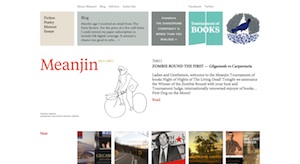
Meanjin has recently undergone a redesign, which has pulled the print and web design closer together. It is definitely one of the more attractive literary journal sites. They’ve also started to publish all their essays, fiction and poetry online.
There is, however, considerable whitespace on the lefthand side of articles. Articles are linked by type – fiction, poetry, memoir, essay – but there is nothing to indicate which issue the item is from on the article pages. Meanwhile, authors themselves are not linked so readers can’t easily find what other issues they might have written for. The article listing, on the home page, only links to articles via the image and not the text – something that occurs throughout the site. It is a problem Meanjin doesn’t link the text, as it means the links are not distinct and are potentially misleading for readers. A more serious problem is the alt attribute, which lists ‘Puff_puff’ as its content, rendering the links meaningless for non-visual users.
Blog post titles are not linked, forcing readers to access them through ‘Comments’ and ‘More’. Furthermore, scrolling through post history is impossible, as archived posts are unavailable in the listing.
Meanjin’s Facebook and Twitter accounts are active and entertaining. They have an enewsletter that is easy to find and sign up to, and readers can subscribe and buy back issues easily from the MUP website that link from Meanjin.
Overland
- Website:
- overland.org.au
- Facebook:
- www.facebook.com/overland
- Twitter:
- @OverlandJournal
It is said that people who live in glasshouses shouldn’t throw stones. So for full disclosure: I work on the Overland website, which I am currently helping to redesign.
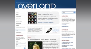
The blog is regularly updated with almost exclusively nonfictional content: topical or reviews. Only one post appears on the homepage but the last five also appear in the sidebar; with a high turnover of content it is easy for posts to disappear. Posts don’t link to related posts, journal articles or topics such as Afghanistan. Bloggers have linked indexes so you can see what other posts they’ve written, though this doesn’t indicate if they’ve written any articles.
Full content is available since issue 188 (2007). It is easy to detect which issue each article was in, but there isn’t a way to get all the poetry or essays, and authors aren’t linked so you can’t easily find other articles they may have written.
The editorial team’s Twitter feeds are on the website and Overland’s Twitter feed is regularly updated and entertaining. Overland on Facebook is a person rather than a page, which isn’t good.
The journal doesn’t offer ebook versions. Readers can subscribe online, though purchasing back issues is difficult.
Submitting to Overland through Submittable (previously Submishmash) is an easy, electronic process that allows you to track submissions. (I honestly expected more journals to use submission management systems, because it’s an area that saves time.)
Southerly
- Website:
- southerlyjournal.com.au
- Facebook:
- www.facebook.com/people/Southerly-Journal/100001523614044
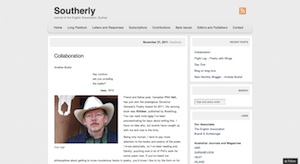
The Southerly blog alternates each month with a guest blogger. It’s a nice technique that keeps the site alive and gives the reader a familiarity with that writer. Writings are a combination of poetry, fiction and non-fiction. In-between guest posts are launch notices, letters and correspondence, and overviews of upcoming issues. In one post, the Southerly editorial team ask questions to shape prospective comments, such as:
- How does the post relate to your local literary community? Or if you’re a reader from outside Australia, how does it relate to your national literary culture?
- Have you read something in the Long Paddock, or in our hardcopy issue, that relates to the blog post?
One of the stranger comments policies reads:
7. Comments must make sense by being in sentences complete with punctuation, to reflect the literary nature of the blog.
The ‘Long paddock’ is extra online content. I like the additional essays, poetry and reviews, but despise Issuu the Flash-based system they use for displaying them. It’s annoying to use and I don’t enjoy reading with it. Additionally, while they have the mobile template for the site Issuu, Flash doesn’t work on my iPhone or iPad (there is supposed to be a HTML5 fallback but I didn’t see it).
Lastly, purchasing a subscription online involves downloading a form, printing it, filling it out, scanning it, and emailing it in. I imagine an online purchasing system, even a simple Paypal button, would help increase subscriptions.
Voiceworks
- Website:
- expressmedia.org.au/voiceworks/
- Facebook:
- www.facebook.com/pages/Voiceworks/24919754944
- www.facebook.com/express.media.australia
- Twitter:
- @Express__Media
Voiceworks is the journal for under 25-year-olds.
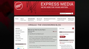
The website runs off the Express Media website and domain. Virgule, a variably updated blog (sometimes daily, sometimes monthly) greets readers on the homepage. There is a Facebook page that is rarely used, although the Express Media Facebook is regularly updated with Voiceworks information. Voiceworks’s identity is largely tied up with Express Media. I imagine it would be more effective to separate out the identities so that Voiceworks is presented less as a project of Express Media and more as a unique journal (which the print design does effectively).
Wet Ink

- Website:
- www.wetink.com.au
- Facebook:
- www.facebook.com/pages/Wet-Ink-magazine/14043129978
- Twitter:
- @wetink_mag
Wet Ink appears to be a static site without a CMS. I like the design (apart from the ‘click heres’) but imagine it will need to transfer to a managed system soon. Back issue articles are only available as PDF and there is no means of searching by author or topic. Wet Ink links to their Facebook page although not their Twitter account, with both only occasionally updated.
A subscribe page gives readers the opportunity to subscribe to the journal.
Online only journals
Of the three online-only journals looked at, two didn’t use a CMS – Peril was the exception – and all published more than one poem per page (either the same author or all the poems of that issue). Ideally, each poem should have a unique page. For online journals this is even more important as the URL acts as a unique identifier for that poem. Multiple poems per page seems to be a print affectation that has carried into the online space.
foam:e
- Website:
- www.foame.org
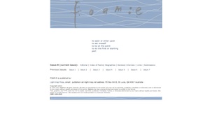
With no Facebook page, no Twitter account, no enewsletter, it appears foam:e gets by on reputation alone – the first editorial did state Poetry speaks for itself
. Reasonably successful for what it does, the only disappointment is that there is no way to view all the poetry by a specific poet.
Mascara Literary Review
- Website:
- www.mascarareview.com
- Facebook:
- www.facebook.com/people/Mascara-Literary-Review/100000123527263
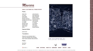
Mascara has a presence on Facebook but the social media stops there. Once again there is nothing to link the authors with their work across issues. When on a page there isn’t an easy way to get back to the index of that issue.
Peril: Asian-Australian Arts and Culture
- Website:
- www.peril.com.au
- Facebook:
- www.facebook.com/PerilMag
- Twitter:
- @PerilMag
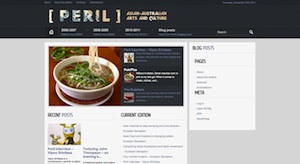
Peril is the most like the print journals in regards to engagement on social media and also on the website. The site links to their Twitter account, and also includes the current stream, and is very active and interesting.
Previous issues are clearly indicated in the menu and the poetry page of the current issue links via the related post to the previous issue’s poetry. The fiction and non-fiction aren’t identified in the listing and there is no contents page for a quick overview. They have a blog but it only has two posts and they are from September – here is an opportunity to use some of the energy that exists in the Twitter feed to have ongoing conversations on the blog!
Again, like many of the journals, Peril doesn’t link authors or topic areas and they publish all poetry on a single page.
Where to in four years?
As far a as prognostication goes, I rate myself 3 out of 10 as a prophet. That said there is a lot going on in the technology world that might give some indication of where journals might head and what opportunities there are for them.
Convergence between web and ebooks are growing. Many of the ebook formats including EPUB, which is widely supported and adopted, are built on web technologies. This makes converting between web content and ebooks quite trivial. With EPUB 3 scripting has been allowed and along with rich media and devices that support this, the differences are reducing.
This also means readers will have an opportunity to mix and match articles (even if not directly supported by the website) and produce their own journals.
That’s not to say print is dead. With print-on-demand expanding, traditional journals have a cheaper way to sell overseas, printing directly in that country, and can have flexible print runs by printing only what’s needed.
Lastly, it will be interesting to see where social media will be in four years. Google+ has recently added pages for organisations and Facebook and Twitter appear to be going strong. In the short history of social sites, however, popularity can dissipate as quickly as it grows.
Note: all of the screenshots in this article were taken on 25 November 2011. The image at the top of the article is from the Literary Magazines Australia website.


