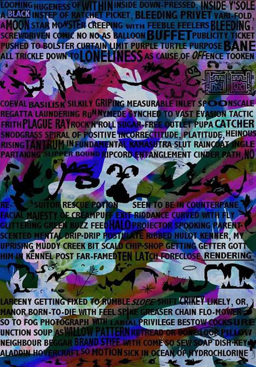
The text colours likewise suggest sensory perceptions beyond the typical limits of poetry (‘in the phosphorescent present of the toxic jungle’, Plate 008-009), particularly when the letters of a word are visually manipulated to imitate that word’s semantic sense – a procedure more common to concrete poetry, which we might call ‘optomatopoeia’ (‘which we elongate…’, Plate 004-005). Perceptions beyond the visual, aural, and semantic senses likewise tend to be aroused when the text is combined with it surrounding images (‘his tune was larfin / twangin’ up a storm with Gnarlick Fingus’, Plate 022-023) or punctuated by images imitating the words (the sofa, flames, et. al., Plate 026-027), a kind of visual ‘Mickey Mousing’ analogous to cartoon music composers’ direct imitation of on-screen characters.1 In each of these cases the information the reader is given is nearly too much to digest alongside the complex textual and visual components themselves, and the surfeit of information may be experienced as overflowing the usual sense receptors for poetry and art and aesthetically engaging the tactile sense.2
OPTICAL SYNOPTIX
The different kinds of artwork in BLAKE are dauntingly varied: crayon drawings (Plate 028-029), watercolour washes (Plate 036-037), photographs (Plate 092-093), collage (Plate 070-071), (Plate 080-081), (Plate 134-135), (Plate 136-137), freehand ink drawings (Plate 190-191), drawings made or manipulated within MS Paint (Plate 200-201). Almost every plate is a mixture of at least several different media, making it difficult to ascertain, for instance, where hand-drawing leaves off and mouse-drawing begins (Plates Plate 100-101, Plate 182-183). There are even drawn imitations of collage (Plate 138-139), text collage (Plate 154-155), and enlargements and collage-variations of earlier pages (Plate 156-157). While the plates unmistakably resemble nothing but themselves – particularly the MS Paint creations, for which I know of no prior model – in each medium Watson’s style evokes numerous earlier sources, which may be worth unpacking.
In pen-and-ink drawings, cartoonishness is Out To Lunch’s milieu. Specifically, though comic strips like the Bash Street Kids (the colour centerfold of the comic Beano) are referenced (in Plate 026-027, and directly collaged into Plate 114-115), the model seems most likely Robert Crumb’s late 1960s/early 1970s production (with Crumb likewise referenced in Plate 026-027). Squiggly, weird and perverse invocations of urban life and poverty characterise that stage of Crumb’s artwork, and that preformative cartoonishness, not yet technically honed into his later cross-hatched realism, has left an impression on OTL’s style. Even in the life-drawings, as in OTL’s recurrent hand intruding into the drawing in the act of being drawn, photographic fidelity is less important to OTL than the form’s expressive lines and textures. The impossibly detailed figurations over-populating every page remain accessible, even childlike, for their scrawling cartoon provenance.
The crayon drawings and watercolours, though least in evidence among BLAKE’s media, reveal an important aspect of OTL’s art. In both media he nearly abandons figuration while still suggesting its immanence, creating a wash of often clashing colours overlapping as though consuming one another. The style seems to derive from painting, particularly the improvisational expressionism of late-period Asger Jorn, where thickly laid colours constantly verge on figurative shapes. The watercolour of Plate 190-191 seems chance-determined, as though resulting from natural phenomena, comparable to Penelope Rosemont’s alchemigrams. Its colours swirl like a neon lava-lamp or a photographic negative of the Milky Way, perhaps solarised or otherwise digitally manipulated in MS Paint. In Plate 160-161, the crayon scribbles intersect haphazardly, creating only regions of colour rather than suggesting form or space. The plates with either crayon drawings or watercolours almost always feature other elements drawn or collaged over and around them,3
The collages, most prevalent throughout the book, articulate the overriding aesthetic conducting all the other media. There is a dadaistic disregard for smooth continuity, and a joyfully impish drive towards incongruity of elements. While Hannah Höch and Raoul Hausmann’s early subversive photomontages, like Hausmann’s Elasticum or Höch’s Schnitt mit dem Küchenmesser Dada durch die letzte weimarer Bierbauchkulturepoche Deutschlands, with their fill-every-open-space maximalism, could serve as models for OTL’s work, there’s too many disparities to ignore.For one, the photographed faces were carefully posed and frequently collaged into composites, whereas OTL’s photos are offhand family snapshots, always inserted into BLAKE as is, without cuts. In another disparity, Höch and Hausmann eschewed all traces of handmade aesthetics in favour of the hard-edged juxtaposition of photographs and machine diagrams. OTL includes such materials as well, but his inclusion is far more messy than theirs, almost always entailing further alterations, manipulations, handling. For a model of that aesthetic, one needs to look to the record sleeves of some of the popular music Watson lives for, particularly to album designers like Funkadelic’s Pedro Bell and Frank Zappa’s Cal Schenkel, both virtuosi artists of information-overloaded mixed-media personalised disorder; as well as a likely primary inspiration to both artists, the dada outlier Kurt Schwitters.
Consider what Watson has written about Kurt Schwitters, and how closely it describes and tracks Watson’s own philosophy and aesthetic:
Co-ordinated rubbish could be more beautiful than any icon made of gold and pearls, more real and urban and modern than any oil-painting, however advanced its way of seeing! You stared-in close at a Schwitters’ Merz (he had to invent a word for what he did, ‘collage’ sounds like something made of coloured tissue paper or cuttings from colour supplements; a ‘montage’ implies clean, hard-focused photographs … Schwitters’ materials all reek!), and every one is full of mad puns and references and mindbending absurdities, chock-a-block with real information about everyday life in Berlin and Hanover in the 20s and 30s – but also insane and colourful and poetic. Like life actually is. No boring ‘once upon a time’, no tedious mise-en-scène, no chiaroscuro or tender evocation requiring plot and lighting and stage-management – but bits of past time’s actualities stuck all over the picture surface! Schwitters’ Merz collations wriggle and burn with infantile charm and subversion. A Modern Art anything-goes Rabelais, a visual Finnegans Wake, a tramp-who-would-be-king, another member of the true secret humble vainglorious literati to engage in jest with! Kurt Schwitters, the best thing to hit the twentieth century. For, Comrades … Rubbish Is Pertinent!4
This captures almost perfectly Out To Lunch’s creative impulse in BLAKE – in the course of fifteen years since that essay’s publication, I think William Blake’s visionary universalism and Watson’s experience raising children have been the primary ingredients newly added to bring that stew to a boil. While Schwitters’s Merz presides like a trickster spirit over the poem’s ‘bits of past time’s actualities’, it is through OTL’s ‘record(ing) the vital forces of a particular body’5 that he is able to supersede Schwitters’s influence and to shape his own unique objects from disparate sources, speaking to universal forces through the uncompromising insistence on particularity.6
- Apart from the example of cartoon cinema, another possible source for such combined visual/semantic sensory overload effects could be William Blake himself: as Esther Leslie writes of Blake’s The Marriage of Heaven and Hell, ‘The argument of a line’s words turns into a graphic representation of its sentiment. … All this detail makes the page’s surface a dynamic space of interrelating elements. It fizzes with life. The surface swarms. Blake’s “infernal” procedures of printing allowed him to entangle words, illustrations, and lines on the same copperplate. … In Blake’s method of etching in relief, a reverse of the conventional intaglio mode, acid’s bite chews through the “apparent surface” of the plate, bringing to the fore a new, now raised surface of word and image, expressive modes most usually kept apart and here united, just as are Devil and Angel, Heaven and Hell, body and soul.’ (‘Blake’s Lines: Seven Digressions Through Time and Space’, in ImageTexT: Interdisciplinary Comics Studies, Vol. 3 No. 2 (2007). ↩
- Though perhaps other readers might experience taste or smell as strongly as I have tactility, or perhaps a synaesthetic ‘translation’ of the senses, in which colours are ‘heard’, patterns ‘tasted’, in lieu of being seen, heard, etc. The act of reading BLAKE becomes itself an engagement with the body’s particularities and sensation’s outer reaches. ↩
- The one exception being Plate 112x-113x, the ‘Intersex’ drawing, again indicating that plate’s singular importance within the work. ↩
- Ben Watson, ‘Towards a Critical Madness’, in Mad Pride: A Celebration of Mad Culture, eds. Ted Curtis, Robert Dellar, Esther Leslie and Ben Watson (London: Chipmunka Publishing, 2000): 105-123 (111-112). ↩
- W.C. Bamberger, Riding Some Kind of Unusual Skull Sleigh: On the Arts of Don Van Vliet (Whitmore Lake, Michigan: Alap Editions, 1999): 35 – though Bamberger here writes of Don Van Vliet (aka Captain Beefheart), another poetic/artistic polymath. ↩
- or, as in Plate 018-019’s conversation with the cosmos, ‘my body talking through the very trough you are’, which may well be said by cosmos, author, or reader. ↩