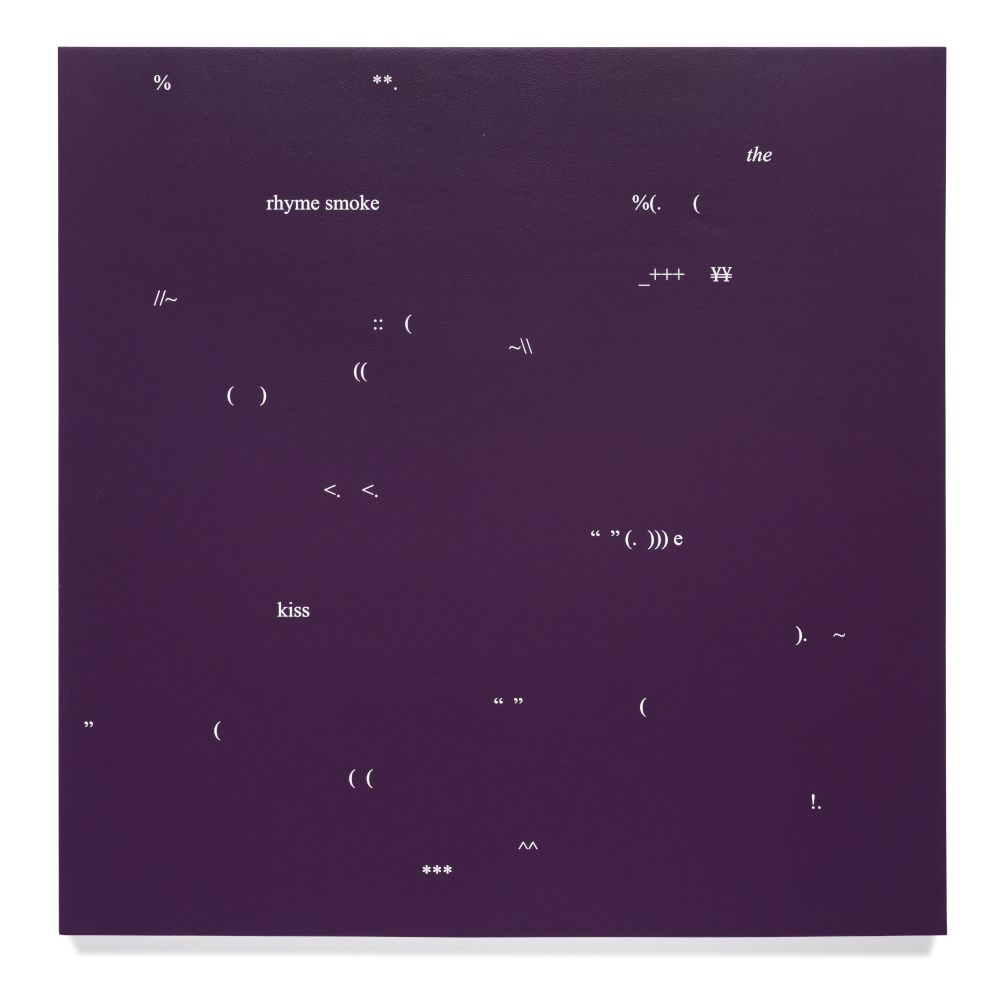
‘Opinion Fatigue (rhyme smoke)’ 2022 | acrylic on marine plywood | 1 x 1 m | Private collection | Photo by Louis Lim | Courtesy of the artist and Onespace
For Opinion Fatigue, Sebastian Moody has produced a series of monochromatic voids punctuated by sparse bouquets of typographic symbols. Very occasionally, a lone word appears. Created via a playful navigation of a Microsoft Word document, the scatological constellations recall the all-over compositions of mid-century avant-garde painting – the canvases of Arshile Gorky, Jackson Pollock or Mark Tobey. Adhering to the rigid verticality imposed by digital technology, the typographic forms are all right-side up: a submission to the grid of culture, but one that doesn’t abandon chaos.
On one canvas, the word rome appears in lower-case Work Sans font. A neo-Grotesque typeface, the style derives from sans-serif variations of the eighteenth century. These were titled Grotesque due to their being perceived as offensive affronts to their more ornate Roman-inspired predecessors. On another canvas, loosely framed with a little dipper-like formation of colons and semi-colons, a tilde, and several exclamation marks, the word feather appears in italicised Times New Roman. Perhaps inadvertent, this typographic choice might serve as a subtle dig at Stanley Morison, the typographer who designed the font in the 1930s. Though he eventually relented, Morison loathed italics. He believed they should be abandoned due to their disruptive influence on the flow of continuous text. Indeed, his typography was created for efficiency: to maximise the number of words that could fit on a page while maintaining an easily readable typeface. Letters, he argued, should ‘neither be very ‘different’ nor very ‘jolly’’.1
When written in the curly font, feather almost teases the semiotic status of the word as a signifier, blurring the distinction between symbol and icon. In its italic form, the f both ascends and descends – extending from the typographic baseline in both directions. On its own, the f might resemble the arch of a thin, free-floating feather or a quill. In the word itself, the flick of the italicised f corresponds with the downy tufts at the base of a contour feather. The midline carried by the horizontal strikes of the f and the t correspond to the feather’s shaft, while the voluminous swirls of the e, r, and f, and the offshoots of the ascending letters t and h, echo the de-shelled vane of a plumule. Indeed, italics create feathery words: words that operate as decorative plumage, indicating a title or differentiating spoken words within a text, signalling their light, ephemeral quality. As Morison feared, italics ruffle text, giving it literal and figurative texture.
A close observation of the canvases in Opinion Fatigue reveals barely perceptible bleeds, delicately feathering the edges of the elaborately stencilled white symbols: a detail that betrays their painterly status. To my mind, this painted typeface echoes techno-minimalist aesthetics, and the merging of traditional and futuristic materials and motifs exemplified by wooden digital clocks with subtle LED displays, glitched textiles, and touchscreen digital tablets with rough-textured screens resembling paper that converts handwritten text to Word documents. These gimmicky consumer products exemplify the contemporary emphasis on minimising the sensory disjunction between technology and organic textures and gestures. They cultivate domestic environments free of the aggressively sterile utility of appliances, instead favouring technologies that are covertly integrated, wireless, unseen, voice-activated or remotely controlled, an allegory of the inextricable and pervasive influence of technology today – the omnipresence of surveillance capitalism, data mining, and the concurrent hyperawareness of self-presentation mediated by clicks and keystrokes.
Concurrent with Opinion Fatigue, Moody’s work occupies the Open Studio – a space showcasing projects by contemporary artists in the Queensland Art Gallery and Gallery of Modern Art complex. Moody has decorated the floorspace with large typographic symbols. A pair of brackets forms an open oval as the centrepiece. The room is walled with mirrors. Furnishing the reflective light-filled space are ottoman benches that recall the shape of orange slices. The arrangement, and the orange-slice shapes, are a playful reference to Orange Event no. 3 (1963), a Fluxus artwork by Bengt af Klintberg gifted to Queensland Art Gallery in the 1990s by Francesco Conz. In this conceptual piece, participants are asked to arrange the orange slices in a row – an act that transforms a spherical object into a line, imbuing an everyday gesture with creative possibility. In Moody’s large plush rendering, the arrangement takes on a new scale and interactive potential.
- Stanley Morison, First Principles of Typography (1936: reis., London: Cambridge University Press, 1967), 8. ↩